Organising data for graphs in R
/I often get asked to help others to make graphs, which is a pleasure cause it is super fun. Usually, the question arises after ggplot returns an error and (excluding very simple syntax errors) the issue almost always comes down to data structure.
Note: For this post, I am using ggplot exclusively. I have used many other packages that have different (usually worse) data requirements. If you need to use another package, read the data section of the documentation very carefully!
Firstly, you will want all your data in the one data frame. Ggplot is designed to group data by whichever variable you wish within the one data frame. This means that you should only identify the dataset once. If you find yourself using "data = ..." more than once, then you are probably doing something wrong, and it will lead to overly complex graphs which are easy to screw up.
Example
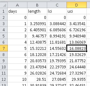
A common problem is that some analysis program has spewed out a bunch of model predictions into data files. Here, I am using very, very fake data resembling von Bertalanffy individual growth models. Each growth model prediction has been output to a single csv file.
Bad design
# Read dat -----------------------------
laur_male_pond <- read.csv("csvs/laur_male_pond.csv", header = TRUE)
laur_female_pond <- read.csv("csvs/laur_female_pond.csv", header = TRUE)
laur_male_stream <- read.csv("csvs/laur_male_stream.csv", header = TRUE)
laur_female_stream <- read.csv("csvs/laur_female_stream.csv", header = TRUE)

# Create plot -----------------------------
ggplot(data = laur_male_pond, aes(y = length, x = days, ymin = lci, ymax = uci)) +
geom_line() +
geom_ribbon(alpha = 0.2, fill = "red") +
geom_line(data = laur_female_pond) +
geom_ribbon(data = laur_female_pond, alpha = 0.2, fill = "blue") +
geom_line(data = laur_male_stream) +
geom_ribbon(data = laur_male_stream, alpha = 0.2, fill = "green") +
geom_line(data = laur_female_stream) +
geom_ribbon(data = laur_female_stream, alpha = 0.2, fill = "orange") +
theme_bw()
Here we have chosen the simplest form of data entry, but it has cost us in requiring complex code for the graph. This code is not only long, but hard to adapt into future graphs and prone to errors. For example, if you had the same model predictions for another species, you would need to change the data name multiple times.
Good design
# Read dat -----------------------------
files <- list.files("csvs/")
open_data <- function(x) {
data <- read.csv(paste("csvs/", x, sep=""), header=TRUE)
data$file_name <- x
data <- cbind(data, df <- data.frame(do.call('rbind', strsplit(as.character(data$file_name), '_', fixed = TRUE))))
return(data)
}
combined_growth <- adply(files, 1, open_data)
colnames(combined_growth) <- c("days", "length", "lci", "uci", "file_name", "species", "sex", "habitat")
combined_growth$habitat <- substr(combined_growth$habitat, 1, nchar(as.character(combined_growth$habitat))-4)
# Create plot -----------------------------
ggplot(combined_growth, aes(x = days, y = length, ymin = lci, ymax = uci, group = file_name)) +
geom_line(aes(linetype = habitat)) +
geom_ribbon(aes(fill = sex), alpha = 0.2) +
theme_bw()
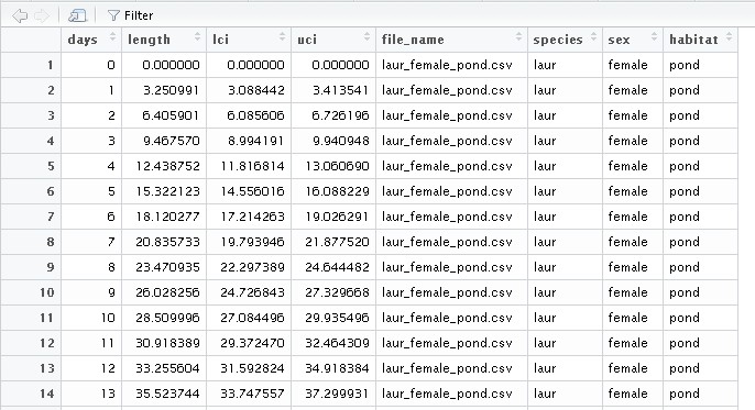
Here, data entry is much more complex. I have had to combine all the csv files into a single data frame and then split the file name into separate categories (species, sex and habitat type). This could easily be done in Excel if you are not confident in data manipulation in R, but I would recommend it as a good exercise in data manipulation.
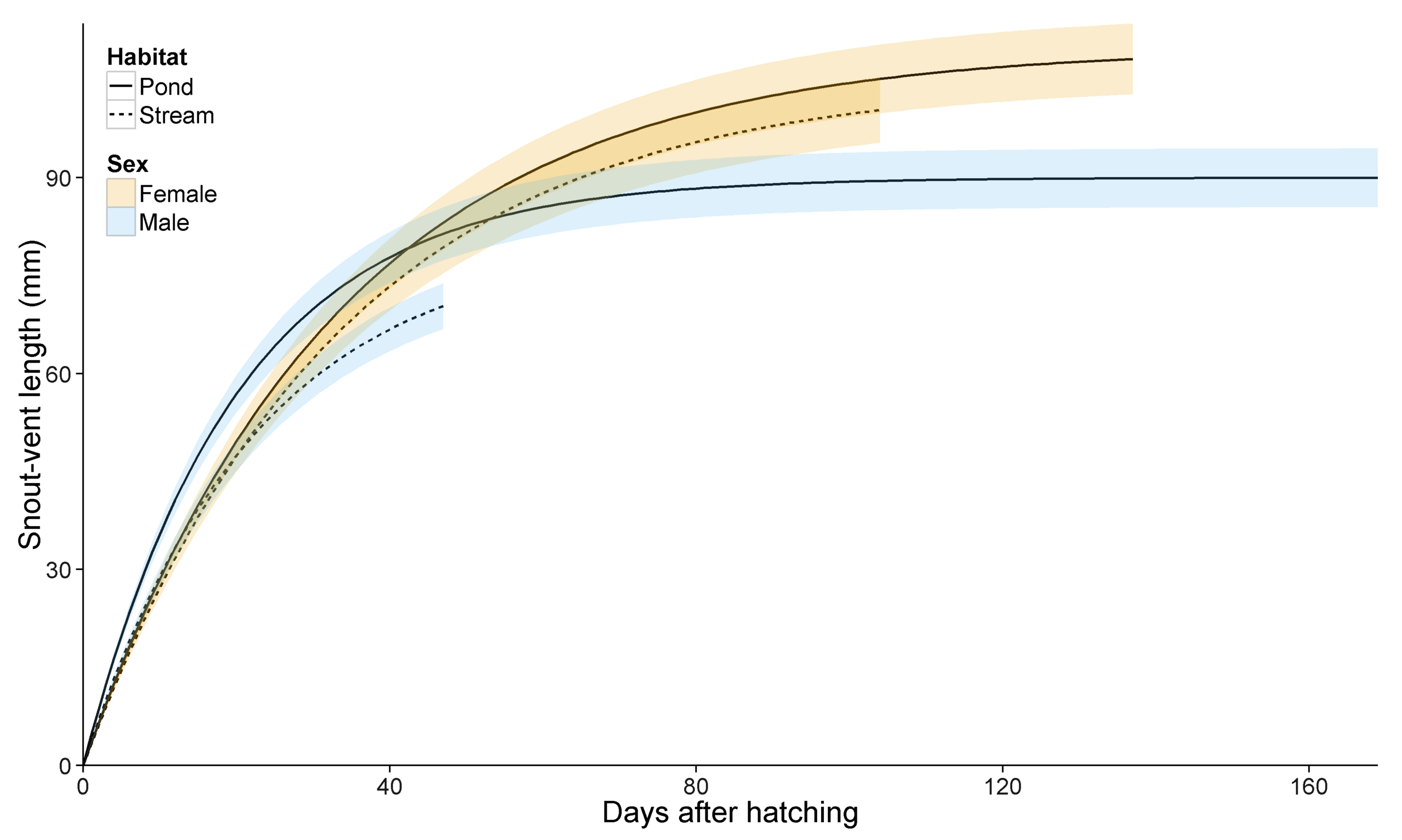
The work put into cleaning the data pays off in the final plot. Just four lines of code to achieve a very similar graph, and it is incredibly easy to save this code and adapt for future graphs. It also automatically creates a legend.
Final design
With some added code to make things pretty (theme_evp is my personal theme for my commonly used options)...
cbPalette <- c("#009E73", "#CC79A7", "#F0E442", "#E69F00", "#56B4E9", "#0072B2", "#D55E00") #Colour-blind palette
p3 <- ggplot(combined_growth, aes(x = days, y = length, ymin = lci, ymax = uci, group = file_name)) +
  geom_line(aes(linetype = habitat), size = 0.7) +
  geom_ribbon(aes(fill = sex), alpha = 0.2) +
  ylab("Snout-vent length (mm)") +
  xlab("Days after hatching") +
  coord_cartesian(xlim=c(0, max(combined_growth$days)), ylim=c(0, max(combined_growth$uci))) +
  scale_fill_manual(name = "Sex", labels = c("Female", "Male"), values = cbPalette) +
  scale_linetype_discrete(name = "Habitat", labels = c("Pond", "Stream")) +
  theme_evp() +
  theme(legend.justification = c(0, 1), legend.position = c(0, 1), legend.box.just = "left")
ggsave("plot3.tiff", p3, width=300, height=180, units="mm", dpi=300)


